
Float
(Floaters:
0 )
Description:
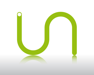
Logo done for personal use - let me know what you think..
As seen on:
Status:
Nothing set
Viewed:
1428
Share:
Lets Discuss
Initially I see the letters 'I' and 'N'. **If I turn my head, I see the S, but I think the connection of an 'I' and 'S' is a bit of a stretch.
ReplyUIN?
ReplyHey, thanks for the feedback - It's an I and an S.. Any other suggestions which might make it better you think, or more clear?**any advice on the way the logo is branding itself?
Replytell us what exactly the logo is for and the services of the company and we could be more helpful*
ReplyThe logo is just for personal use - not for a company or anything else, I wanted something simple and effective that would symbolise me in some sort of way.
Replythe dot above the logo looks way out (to me anyway) I think your nick would be better to work with *iSerce %3D) goodluck anyway.
ReplyThanks for the comment, I've uploaded a new one @ http://logopond.com/gallery/detail/18936**Let me know what you guys still think.
ReplyPlease login/signup to make a comment, registration is easy