Description:
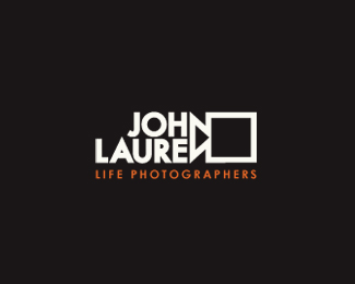
Logo designed for photographers couple.
This is initial design which survived small modifications and finally reached the client. I'm interested in critiques about readability and understanding this one.
As seen on:
www.johnlauren.com
Status:
Client work
Viewed:
3330
Share:



Lets Discuss
Excellent! It's instantly readable to me at least.
ReplyThanks fogra. I browsed your gallery - its awesome.
Reply1 fogra, very good!
ReplyThis is very, very clever. Nice!
ReplyJohn Lauren made for pohotgraphy
Replygreat idea:)
ReplyThank you all fellows!
Replyi love this!
ReplyThanks. Here is updated version in negative and tagline.
ReplyThis is fantastic! I read it perfectly, but I can't speak for the untrained eye.
ReplyThat's a really smart solution. What's crazy is I don't remember floating this.
ReplyVery nice!
ReplyThanks so much guys for getting conversation on this one alive again. Actually this one is among favourites of my own...glad you liked it too, and thanks for floats!
ReplyThis one is featured now on creattica!
ReplyCongrats, this is very nice.
ReplyThis is also publihed in Gareth Hardys %22Smashing Logo Design%22 book.TY once again Gareth :)
Replyperfect integration of mark name, great solution!
ReplyThanks Reno.
ReplyNice Work*
ReplyAlways loved the smartness and clean traces in your work Andrej. Keep it up :)
ReplyPlease login/signup to make a comment, registration is easy