Description:
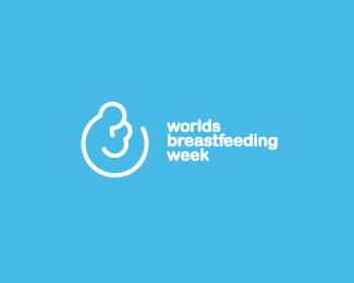
logo for a worthy cause. a breastfeeding icon I've done...anyone seen something similar to it?
Status:
Nothing set
Viewed:
8622
Share:


Lets Discuss
I like it! It made me think of the March Of Dimes logo at first, but I think it is different enough.
Replythanks. March of dimes logo is of the same style indeed, but it shofs breasfeeding from the front view while mine is profile. I also think it's different enough.
Replygreat design
ReplyThanks for looking cesar. I apreciate it.
ReplyThanks for sharing you opinion on this one David.*From one point I'd agree with you. There are two elements that might confuse it with March of dimes: Line art and representation of mother breastfeeding the child. More than enough I agree...but from the other side it's totally different plan and line shaping. And I want to mention that I didn't had March of dimes on my mind when I created this...coincideces happen, small world...
Replyhmm...nope that was not my intention Anthony, I've just picked the same design approach for the same motif...I didn't had any Dimes on my mind then...cheers!
ReplyMy wife and i where talking about if its healthy give to our baby 6 month of Breath...
ReplyPlease login/signup to make a comment, registration is easy