Quayside Orthodontics
by highly • Uploaded: Feb. 04 '20


Float
(Floaters:
3 )
Description:
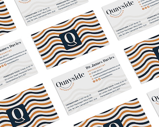
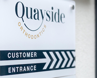
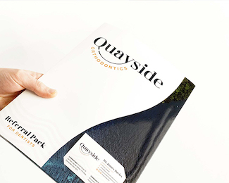
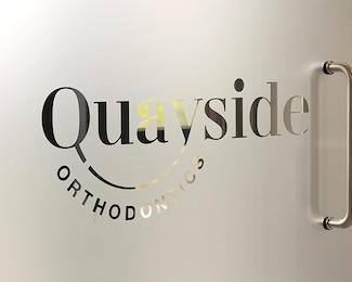
A new name & brand identity to reflect the playful yet classy brand personality traits of this orthodontic practice.
The logo showcases a subtle smile joining the ‘Q’ to the ‘y’ in ‘Quayside’. As with the brand identity as a whole, we purposefully stayed away from explicitly showing teeth or dental procedures, which only add to the stress of a visit.
As seen on:
Highly: Quayside Orthodontics
Status:
Client work
Viewed:
2193
Tags:
smile
•
smile logo
•
branding design
•
branding
Share:
Lets Discuss
Please login/signup to make a comment, registration is easy