Description:
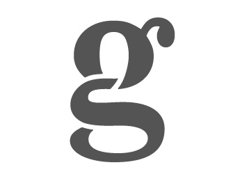
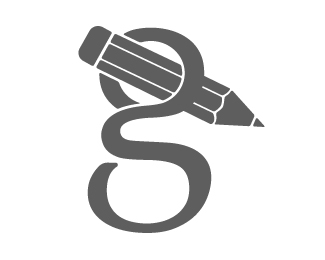
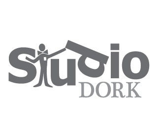
Personal logo using my initials, "G" and "S" (Please let me know what you guys think.)
Status:
Student work
Viewed:
10379
Share:


Lets Discuss
Very good idea, although I think need more definition. What do you think?
ReplyThank you, when you say definition do you mean the %22S%22 needs to stand out a little more?
ReplyHey Gary, just wondering if these might be too close. http://logopond.com/gallery/detail/42842
ReplyOcularInk,**I guess my GS is simular to the one you are referring to. With that said, this logo is different enough and is still in the experimental stage.**Let me know what else you guys think. I'm pretty happy with it, I might curve the S a little more at the bottom left.**All feed back is very much appreciated.....
ReplyI guess I feel you can push it a little further with the execution.
ReplyI agree with you, and I will keep experimenting with it. Thank you for the feedback.
ReplyPlease login/signup to make a comment, registration is easy