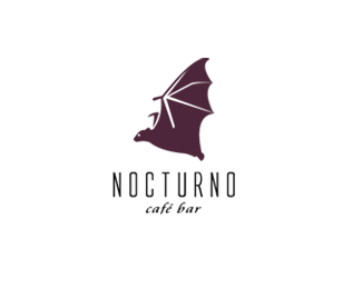
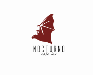
I think that the upper part of the letter L in the mark could flow a bit to the left (not to the right) and still stay obvious as the letter L... That way LS would form more natural glass-like object... And more elegant... By the way, love that Nocturnal logo, you killed it! Just great!


Lets Discuss
I think that the upper part of the letter L in the mark could flow a bit to the left (not to the right) and still stay obvious as the letter L... That way LS would form more natural glass-like object... And more elegant... By the way, love that Nocturnal logo, you killed it! Just great!
Reply...Nocturno... %3B)
ReplyType08 me dices ke la L la ponga hacia la izkierda pero es ke c pierde la copa y no logro lo ke kiero pero gracias de todos modo men...
ReplyLa intenci%F3n es buena, aunque me parece forzado este estilismo. La tipograf%EDa adem%E1s, carece de la elegancia para este caso.
ReplyPlease login/signup to make a comment, registration is easy