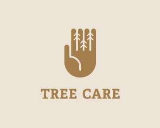
Tree Care 2
by helloagnese • Uploaded: Mar. 12 '15 - Gallerized: Mar. '15

by helloagnese • Uploaded: Mar. 12 '15 - Gallerized: Mar. '15


Lets Discuss
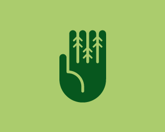
I like this hand mark but it feels as if the type is disconnected. The spacing is what is causing this for me.
ReplyIt is a cool mark, but it feels like the finger tips are cut off.
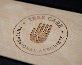
ReplyI like the mark. I think the versions in which the "branches" point downward (basically, the arrowheads point up) are the most successful. I love the etched wood mockup. I agree with Bart on the disconnectedness of the mark to type. This could easily be solved by bringing them closer together.
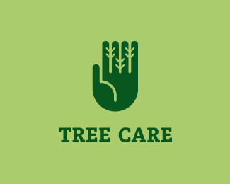
ReplyThank you guys for your feedback! I worked on the typography and also changed the typeface to slab serif as it seemed to fit the symbol better.
ReplyI wonder if others also perceive the symbol the same way Sam does?
The idea is very good. I think you can a) play with the length of the fingers and b) make the "path" a little shorter. Sans serif type is more to my taste.
ReplyI had a symbol version with fingers in different lengths but it didn't work out so well.
ReplyPlease login/signup to make a comment, registration is easy