Description:
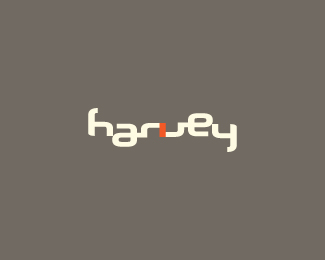
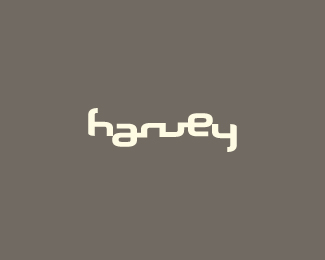
my personal ambigram, still needs some edit i think, comments and suggestions is highly appreciated. thanks.
Status:
Just for fun
Viewed:
2317
Share:


Lets Discuss
I think I actually prefer this one to your update. Try adding the orange to this one as well. Good stuff.
Replyi'll give it a try, thanks for your kind words jgarner.
Replyhere's the update, thanks thanks:)
Replydo u really need that orange stroke?
Replyhi nitish, i can't deside which one is best so what do you guys think? that orange thing is just to emphasize betwwen %22rv%22. But if its readable without orange stroke, i guess no need for that. Btw thanx for the comment. im so glad about it.:)
Replyhi nitish, i can't decide which one is best so what do you guys think? that orange thing is just to emphasize betwwen %22rv%22. But if its readable without orange stroke, i guess no need for that. Btw thanx for the comment. im so glad about it.:)
Replysorry double post.
Replywithout orange, much better.
Replybut you do have to expect that not everyone will read it straight (or at least not at first glance)
ReplyInterested to see this one progress, good luck with it.
Reply@ lecart thanks for helping out on this:)**@ joeprince thanks a bunch man. i really appreciate it.. i'm gonna upload the update soon.
ReplyPlease login/signup to make a comment, registration is easy