Description:
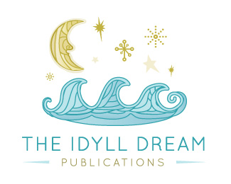
The Idyll Dream WIP Critiques welcome! Updated to medium sans-serif font, and heavier lines are taken out...
Status:
Work in progress
Viewed:
3175
Share:


Lets Discuss
I don't think the slab-serif works here. Maybe something light enough to match the thin lines? Great illustration.
Reply%5E%5EAgree with designtofeel. Sans-serif, medium-heave weight is recommended.
ReplyTypo: meant to say %22sans-serif, medium-heavy weight is recommended.%22
Replythis looks like a %22I gotta pee%22 dream. agree about the font%5E.
Replytake that heavy line off the top of the waves, too.
Replythanks, will update shortly! appreciate the constructive criticisms! :)
Replymuch better. :)
Replyvery interesting
ReplyI think just the moon and waves would be enough... the rest is unnecessary clutter imo... if you could somehow just %22close-up%22 the moon and waves and then set the text accordingly, you would be done.
Replyyeah ... that's a dream ... love it
ReplyPlease login/signup to make a comment, registration is easy