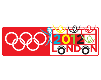
Description:
When I saw the 'LOGO', I was sad and decided to cheer my self up. So I created my own version of what an Olympic Logo should be.
Status:
Nothing set
Viewed:
1636
Share:




Lets Discuss
Nice! (though the rings must always have colour, because they represent continents)
ReplyI'm sorry, but since all is fair game when it comes to the Olympic logo discussion, this looks like a McDonald's Happy Meal graphic featuring a bus full of Euro tourists.
Replyoh my god!! you're totally right Kult House, It does have a happy meal thing going on... I didn't see it until you point it out... Good Call... But I think the concept is different, it was fun.
ReplyPlease login/signup to make a comment, registration is easy