Description:
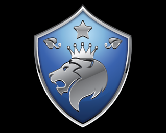
The logo concept devised by our Founder as follows:
Our Company name is "Great Innovus Solutions Private Limited"
Lion with crown: greatness
Polar Star: innovation
leaves: freshness and growth all embossed/positioned on a shield: above qualities are in the heart of the team.
Looking forward to your feedback on the logo.
Status:
Nothing set
Viewed:
7851
Share:
Lets Discuss
I do need your suggestions on positioning our company name %22Great Innovus Solutions Private Limited%22 (long name - but need to position it), the designer is Fernando from Nando Studios. Also provide critics on the logo image itself.. Thanks in advance
ReplyThanks for the kind feedback EastNash (btw: you have a good portfolio, I like the Jill Castle esp)**Regard to Lion, actually we were told that lion roaring towards its right (to us it will be facing to the left) is a symbol of power. And I think most lion logos will either have lion facing straight (MGM: http://www.mgm.com/ - to me it appears to be roaring to its right - but not sure) or roaring to its right (Singapore gov logo: http://www.gov.sg/, Srilanka flag: http://www.brandsoftheworld.com/download/brand/68863.html)**Any feedback for placement of the company name next/below logo, font suggestions etc..
ReplyAny feedback on improvements to this logo?
ReplyPlease login/signup to make a comment, registration is easy