Logistic Solutions
by graphuvarov • Uploaded: Nov. 17 '20

Float
(Floaters:
2 )
Description:
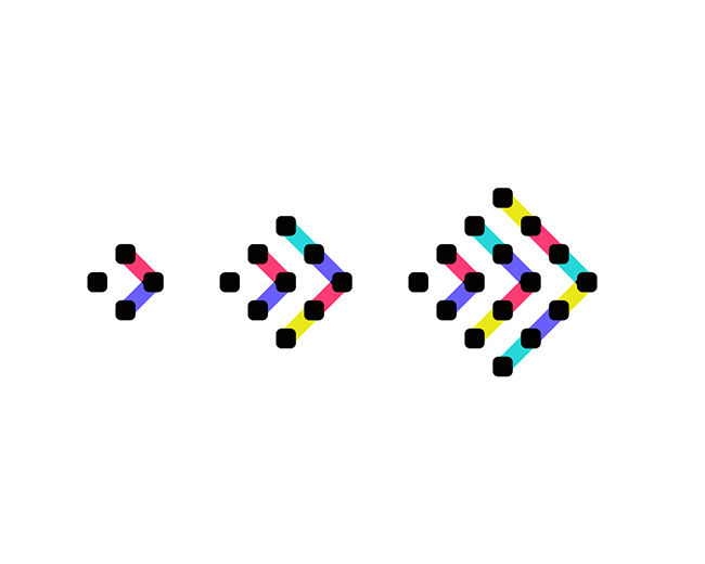
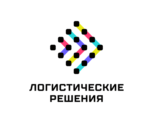
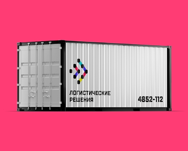
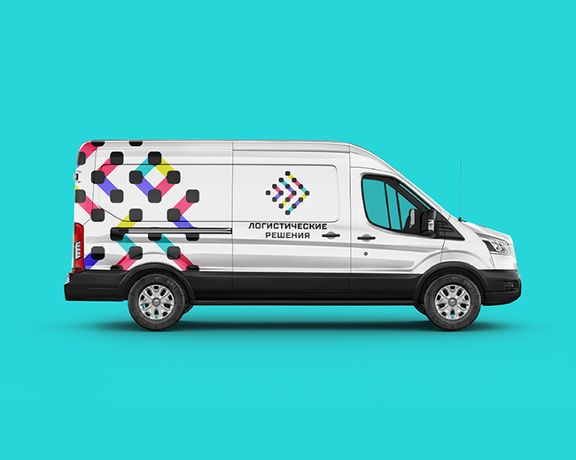
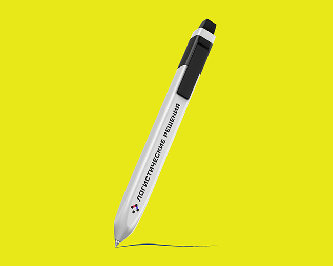
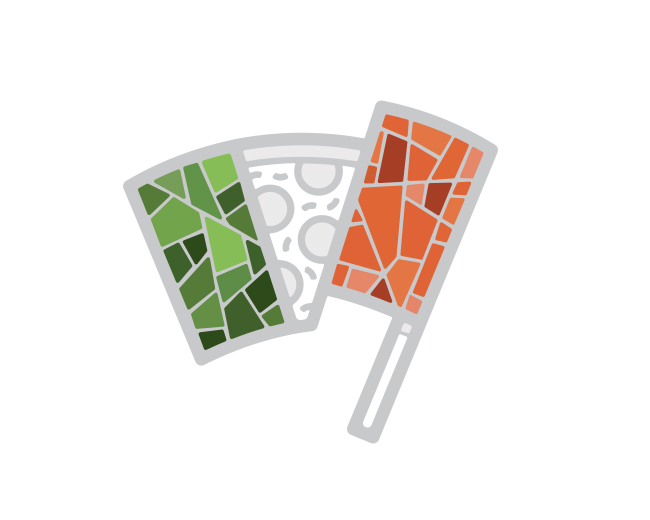
Logistics - flow management in order to optimize them. Just such flows are embodied in the graphics of the Logistic Solutions brand - we transfer documents and cargo from one addressee to another, so that you keep in touch at any distance. The arrows in the sign symbolize speed, and the variety of correspondence is emphasized by a wide palette of colors.
⠀
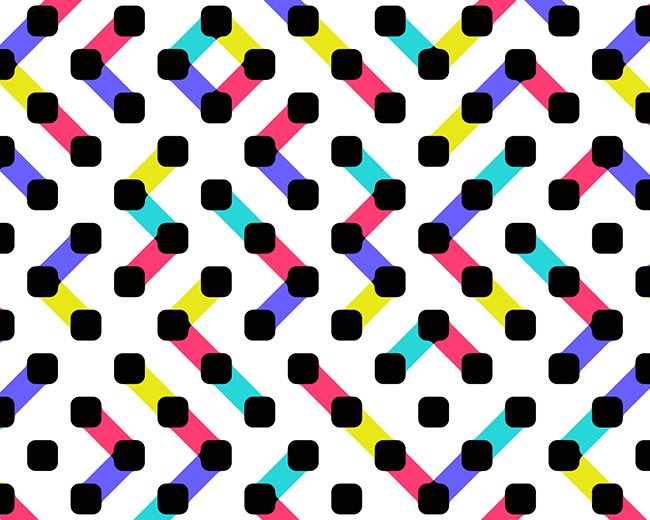
A variable, polymorphic logo creates an image of a laconic but diverse brand, and style-forming elements in the form of a pattern will additionally help to teach the consumer to recognize the brand.
Status:
Client work
Viewed:
2,112
Tags:
logistic
•
logo
•
logistics
•
dots
Share:

Lets Discuss
Please login/signup to make a comment, registration is easy