Float
(Floaters:
8 )
Description:
loft apartments in austin, texas
Status:
Nothing set
Viewed:
2241
Share:




Lets Discuss
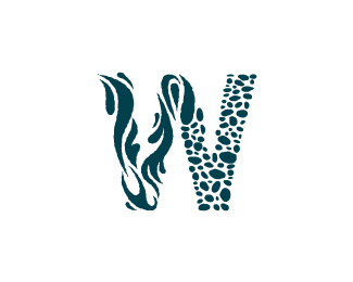
Nice. I really like it. Water's hard to represent with only one color, but you pulled it off well I think.
Replythis really caught my eye
ReplyThis would be even more fantastic if the morphing between the water and the pebbles have a better flow. But loving this all the same.
Replyit was one of those rare situations where the name of the property pretty much designed the logo itself.
ReplyBeautiful, caught me rit away, love to see it with a bit more gradient effect
ReplyLooks very close to Unilever Logo! Nice idea though!**http://www.unilever.com/
Replythere are tons of logos made up of tiny elements, but that doesnt make it %22like%22 any of the others. **gradient?
ReplyPlease login/signup to make a comment, registration is easy