Description:
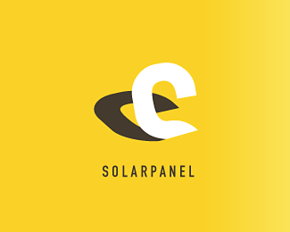
Upcase letter "S" proyecting a shadow. Suitable dor any kind of trusty service or business. Eco-friendly too.
Status:
Unused proposal
Viewed:
4028
Share:

Lets Discuss
This is pretty smart in concept. But, I don't see an 's' there at all. Thought it was a 'C' when I first saw it...
ReplyI see the upper side of an S - if you twist the shadow around it will look more like an s i think. If you do that the shadow will be incorrect but i don't see a problem in that.
ReplyWell....quite honestly, if the viewer has to be 'told' what it is, in addition to going through extra steps just to possibly maybe see it...not a great situation for the client. I'm all for subtlety, but this is not even close. Sorry.
ReplyPlease login/signup to make a comment, registration is easy