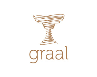
Morami Wine Label
by graal • Uploaded: Oct. 02 '09

Float
(Floaters:
3 )
Description:
Morami Wine Label Logo Design Proposal
Status:
Unused proposal
Viewed:
2857
Share:


Lets Discuss
this looks nice, but i think there can be some interpretation problems. the m is sinking or rising? is that a drunk letter? :) in my vision brigs a bit of doubt and some incertitude. if the use of m is not meant to transmit something else (for example like a bridge, or any other hidden/subtle meaning) i think it needs some reinterpretation. the type looks good so i would keep that.
ReplyThanks for your comment, the m of the logo represent the castle arch of the wine foundry... but i think that your interpretation makes me to review this logo :)*Tnx a lot!
ReplyPlease login/signup to make a comment, registration is easy