Description:
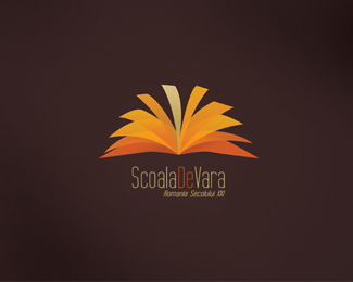
This is a logo I proposed for a Summer School organized by me and some colleagues. It's pretty simple, basically the symbol wants to be a combination between an open book and the sun. You know.. school... summer. :P Did i succeed? :D
Status:
Student work
Viewed:
19980
Share:

Lets Discuss
Well the logo i kinda like, but i dont really c the sun, the book is perfectly clear to read and the colors are cool as well, but as i said dont really c the sun, it would be kinda hard to make it look like a sun actually, but the only thing i suggest is that you make the type on the bottom bigger! scale it so that its as wide as the name, coz from here its impossible to read
ReplyYeah, i know the type is too small, especially if the logo is gonna be printed small, so i am going to make it bigger.**About the sun, I was sort of trying to suggest it through the color choice and through the semicircle formed by the book. It is in the secondary plan, anyway, just as a suggestion.**Thanks so much for your feedback!
ReplyNo problem its still a great logo
ReplyPlease login/signup to make a comment, registration is easy