Glenerd
by glenerd • Uploaded: Jun. 20 '08

Float
(Floaters:
0 )
Description:
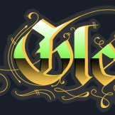
This is my personal site logo as a graphic designer and creative genius.
As seen on:
Status:
Nothing set
Viewed:
1357
Share:
Lets Discuss
ahh modesty %3B)
ReplyI love the treatment!**But the backward letters are unnecessary and just confusing. Readability is tricky enough with gothic and chrome - messing with the type is over the top.
ReplyI agree with jdgimzek. I like it, but the backwards text is a little difficult to read. It makes it more confusing because the d isn't backwards either.
ReplyPlease login/signup to make a comment, registration is easy