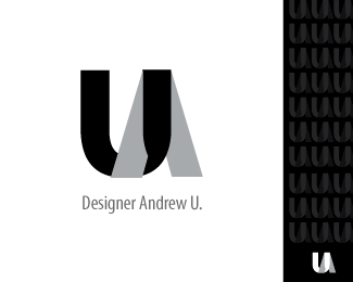
Yes, I agree there is a general point, but it just pops up from memory, because UArtist more conspicuous, which is natural %3D) But if you put the logos side by side, I checked, the similarities do not feel, they have a different slope elements, slightly different thickness and reception with stripes which distinguishes them, I receive letters from the girth ...**p.s. Sorry for bad english...

Lets Discuss
Very nice design, i love the way the letter %22hug%22 each other
ReplyIt looks very interesting. I like it more this way in color.
Replythanks
ReplyI read it as %22UA%22.
ReplyYes, because it's my initials. Usachov Andrew - UA
ReplyVery nice!
Replythanks Wesa
ReplyYeah, very nice indeed.
Replythanks Epsilon
ReplyEyecatching graphics, reminds me United Artists logo a bit ...
ReplyYes, I agree there is a general point, but it just pops up from memory, because UArtist more conspicuous, which is natural %3D) But if you put the logos side by side, I checked, the similarities do not feel, they have a different slope elements, slightly different thickness and reception with stripes which distinguishes them, I receive letters from the girth ...**p.s. Sorry for bad english...
ReplyPlease login/signup to make a comment, registration is easy