Description:
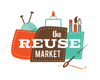
One of the concepts for the new logo of The ReUse Market (www.reusemarket.org). The ReUse Market, a nonprofit, collects, recycles, and distributes new and used arts and craft supplies in the Boise, ID area.
Status:
Unused proposal
Viewed:
6137
Share:


Lets Discuss
i think logo could be a lil bit smaller %26 i don't really know if thread in needle is necessary.. in all very good :)
Replythis is very nice, but i think it would look better simpler, without the pen, marker and those stuff in the background. keep the clew only. regarding the text, yes, make it smaller and for the word 'marker' keep the same font as you have for reuse. just suggestions:p*wait for the updated version.
ReplyThis has potential.
ReplyThanks everyone, for the suggestions and comments! It's been a while since I've checked back here - I have several other versions of this one, including the final one that was chosen by the client. I'll try to get those up soon. :-)
ReplyPlease login/signup to make a comment, registration is easy