Description:
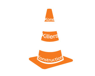
Having a little fun with my construction logo. It is missing something though and I can't quite put my finger on what.
Status:
Student work
Viewed:
954
Share:


Lets Discuss
I like this concept, but the %22killers%22 type needs to be the same size as the rest. I would try and have the text more visible in the white areas.
ReplyI like the play on words, but would like the K's to line up with the edge of the cone
ReplyI like the cone illustration, but the text seems to vanish into thin air.
ReplyI agree fully with AnthonyLane! I love the design of the cone with the white/negative space, however the type is hardly readable. I also don't know about the KKK ref.
ReplyPlease login/signup to make a comment, registration is easy