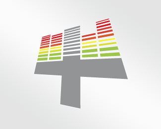
Float
(Floaters:
3 )
Description:
Positive Mix Logo for a Electronic Music DJ
Status:
Client work
Viewed:
1543
Share:


Lets Discuss
It really makes sense. I'd like to see something other than the light gray -- maybe a darker charcoal gray. I'd think a black background would be the most effective, tho. It's a night-time themed business, afterall. Those sharp corners could use a tiny bit of rounding off to add a smoother look, in my opinion. Good work!
ReplyP.S.: If you go black for background, white would work well for the %22plus%22 rather than gray, I believe.
ReplyThanks for your comments, I did some more options including round corners and a dark bground but as you know, customers always wants things be like they want to be so the client finally end up with this one. Anyway very appreciated.
ReplyPlease login/signup to make a comment, registration is easy