Description:
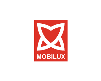
Second proposal for a furniture manufacturer. The symbol is an abstract shape, combining the letter "M" and a heart. Critics are welcome on this one too.
Status:
Nothing set
Viewed:
3621
Share:

Lets Discuss
I like the look and feel of these concepts, but I'm having a hard time relating them to a furniture manufacturer. These all feel more industrial or even 'techy'. One thing that would help is more of an organic color (brown, olive green, etc.).
ReplyNice icon and concept. I feel that something other than Helvetica could have been used. Something along the lines of a custom wordmark could be nice.
Reply@ocularink, they produce modern furniture, that's why we chose this kind of symbol. *@admarcbart, thanks, I'll try.
ReplyPlease login/signup to make a comment, registration is easy