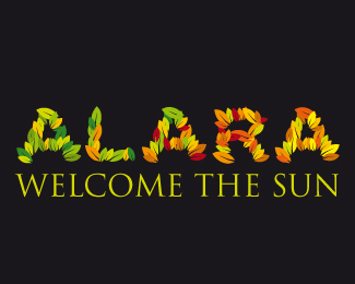
Alara 1
by garrysmith • Uploaded: Sep. 03 '09

Float
(Floaters:
1 )
Description:
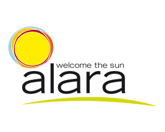
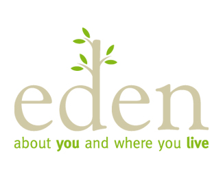
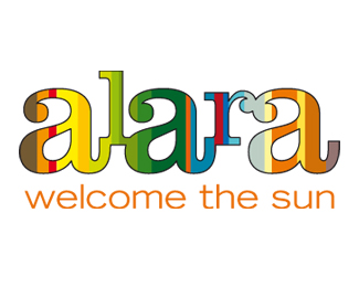
This was one of a number of design ideas for an organic food supplier.
Status:
Unused proposal
Viewed:
1091
Share:
2.jpg)
Lets Discuss
Hi Garry,**I'll just tell it to you straight... The four Alara logos you have here need to be pushed. Narrow down to one concept and really go crazy with it. Right now you don't have much. The sun here is nice, but it's kind of common. The one with the leaves is unique but not well executed. Look through the logos here and pick your favorites. Then study them and see what they have in common. You'll notice two things: %231, they're clever, %232, they're simple. A good logo should appear to the viewer, obvious and effortless. I hope my critique was helpful.
ReplyOne more suggestion from a graphic designer with 30 years in the business... NEVER give your client more than one concept. If you give them more than that, they will pick between them, never giving you real feedback. If I give you a choice of painting a wall blue or green, you will pick... never telling me that you had yellow in mind. **Furthermore, they will always pick the one you don't like and you'll be stuck with it. Give them one good design and then push and push and push that one design until it's great.
ReplyNone of the four options you have here are ready. The leaf version is interesting but poorly executed. The striped version is attractive but I think it doesn't carry the message very well. The one with the yellow orb is not attractive. The sunburst one is common. I strongly urge you to pick one concept and make it good.**I suggest you look through the logos here in the pond and pick five favorites. What you'll see is that the best logos here are clever and simple. A good logo should be obvious and look completely effortless. On this page alone I see ART HIVE by Matto and it's awesome. I like CommunityListingExperts by Maflewdesigns and Message! In a Bottle is clever.**One more suggestion from a graphic designer with 30 years in the business... NEVER give your client more than one concept. If you give them more than that, they will pick between them, never giving you real feedback. If I give you a choice of painting a wall blue or green, you will pick... never telling me that you had yellow in mind. **Furthermore, they will always pick the one you don't like and you'll be stuck with it. Give them one good design and then push and push and push that one design until it's great.
ReplyNone of the four options you have here are ready. The leaf version is interesting but poorly executed. The striped version is attractive but I think it doesn't carry the message very well. The one with the yellow orb is not attractive. The sunburst one is common and has a desktop publishing look. I strongly urge you to pick one concept and make it good.**I suggest that you look through the logos here in the pond and pick five favorites. What you'll see is that the best logos here are clever and simple. A good logo should be obvious and look completely effortless. On this page alone I see ART HIVE by Matto and it's awesome. I like CommunityListingExperts by Maflewdesigns and Message! In a Bottle is clever. Aspire to creating work like those.**One more suggestion from a graphic designer with 30 years in the business... NEVER give your client more than one concept. If you give them more than that, they will pick between them, never giving you real feedback. If I give you a choice of painting a wall blue or green, you will pick... never telling me that you had yellow in mind. **Furthermore, they will always pick the one you don't like and you'll be stuck with it. Give them one good design and then push and push and push that one design until it's great.
ReplyPlease login/signup to make a comment, registration is easy