Genuine Fusion Designworks
by GenuineFusion • Uploaded: Mar. 22 '10

Description:
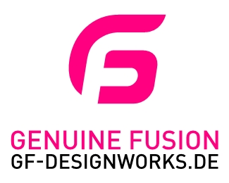
GF / Genuine Fusion. The logo combines the first letters of the design office name “ Genuine Fusion Designworks“and explains it visually.
Used on
http://www.designterror.de/genuine_fusion/index.htm
http://designterror.de/genuine_fusion/index_html.htm
http://designterror.de/genuine_fusion/index_flash.html
As seen on:
http://designterror.de/genuine_fusion/index_html.h
Status:
Client work
Viewed:
6654
Share:


Lets Discuss
http://logopond.com/gallery/detail/5162
Replyebrown, there are definatly similarities. you right, but i never saw this logo before and construct the GF myself. if you like i can post all my freehand files to see the help lines and contstruction process etc. **i still think my logo is much smoother than your example. it flows into the g nicer i think.**
ReplyGregor, I doubt ebrown meant that you copied it. If one sets out to create a GF monogram, this is one of the more obvious concepts to arrive at. **It's just that your and the other logo _are_ really close.
ReplyA little too close, Gregor. I believe that you came up with this on your own, but do to the similar logos it's probably best to take another route.
Replyi dont know ocularink. i developed this log and like i sad. i think the overall flow from F in G is much more balanced than from the other logo. *i never heard about this world wide acting company global feature. there is not even a link to this company. how should someone see this if he doesnt know you?**there is always something similar in the world, but this GF is one color, rounded and not that square stretched style. i am sorry that i came close to your logo but whatever. ****
Replyhttp://www.greenfield-hydroponics.com/turnkey.html*http://www.greenfield-hydroponics.com/**check out this ocularink. i just googled now for GF logo and this poped up. so i guess ocularink, that you copied your logo from them since it looks very similiar to yours. **this company seems to be 10 year old. the website looks 30 years old.**if i would google more i think i would find more samples in this direction which turn maybe similiar also long before you developed the logo for this global feature company....**i think epsilon is right. combining a G and a F will guide you to this solution somewhen.****
Replyhttp://www.pentenrieder.com/popup_image.php/pID/1301**here is also another logo someone name stevie posted on the global feature post to your logo ocularlink.**looks that this idea exist not just since you made this global feature logo. **i never sad that i invented this combination. i just came to this idea of the logo by myself and now since 2 days i see that already since long ago people had something similiar but not the same. i think to 90%25 percent of all done logo i could find something similar made before.**i think i am still standing out with this logo and about patent issues... who should take care about a design office... and if then i could develope a new logo easy if it would be neccassary. its not a logo i sold to another customer like ocularlink. if i would be global feature i would be concerned.
Replyis the bottom right meant to look like a D for %22designworks%22?
Replyyes, the link is to the website domain address www.GF-Designworks.de our web address ( Genuine Fusion Designworks ). Nobody sees actually the D. GF is also my name Gregor Fenger. this domain is very old and we become more people working together and created %22Genuine Fusion%22. we dont wanted to change all domain, emails which customers know.*
Reply@GenuineFusion: You've made your point - all the more reason for a complete change of direction don't you think?
Replyfirebird, maybe i missunderstood you but i dont know. you mean start crowling the web and designbooks for similarities of your logos. do you think i will not find something what exists before you have developed it?**
ReplyFirebrand word swap: Because it's such an obvious solution, why don't you do something else? Either way it's unoriginal.
ReplyYou have quite an aggressive manner don't you GenuineFusion? You've already managed to embarass Ocularink needlessly. What are you saying? You want to search the internet for logos similar to mine?
ReplyI agree, %22firebird%22 (:P). No need to embarrass Kevin this way. And this piece is DEFINITELY too close to Kevin's logo.
ReplyUnfortunately this occurrence happens quite a lot in our industry. If you come across another concept that's too similar to one yours - you just have to suck it up and start again. **You will have a better design for it (because it will be original) and you'll be a better designer for it (because you'll have learned a lesson).**Also this is a very small and tight community so getting aggressive with other designers who are only trying to help you isn't advised. It will turn around and bit you in the ass someday. ***
ReplyFeeling the love friends...thanks! @GenuineFusion : If you take a step back, you'll see we are all only trying to help.
Replybut who was first? or do we find more of those logo variations. if you say this logo solution is not original then you say it also to ocularlnk.**- ocularlnk**- him.., http://www.pentenrieder.com/popup_image.php/pID/1301**- or him..., http://www.greenfield-hydroponics.com/**i guess they are somewhere always similar logos out there. not only for this logo. for sure also for other logos as well. ****like you probarly all know. logos and trademarks are conected to the registered trademarks, country, combination of name and logo, classification, use proof etc.**till now i am happy with the logo even you think its not original. if i find time in future i will change it maybe. **ocularlnk, i dont wanted to say either you copied your logo. i just wanted to show that its easy to find similiar things from the past even the appearance and look is different.**i picked up epsilons theory on this. since nobody of us designers is searching the web, all patend registers and all signs in the world before he is starting his work process... similiarities will happen.**or you become a trademark lawyer before you will become a designer.**peace.
ReplyVery, very well put birofunk!
Replyhttp://logopond.com/gallery/detail/12922
Reply@genuine fusion, stop digging that hole. If you plan uploading logos here on a regular basis looking for feedback, insulting Kevin, who has been on this site since the near beginning and is a well like and respected member is not the way to go. I am going to give you the benefit of doubt on your responses as english is probably not your first language, but go easy. Regardless your logo is a nice monogram and its easy to see it combining the three letters. Maybe you should emphasize this particular point.
ReplyPlease login/signup to make a comment, registration is easy