BOGANI
by Logomotive • Uploaded: Jan. 22 '10 - Gallerized: Jan. '10
Description:
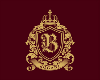
Custom Design done for one of my favorite clients and friend. Bogani Family Crest. All vector line art. No gradients used.
As seen on:
www.bogani.com
Status:
Client work
Viewed:
31554
Share:



Lets Discuss
very very nice job. Would love to see your process on how you got that from sketch to final. Colors are great aswell. Man you must be awake 23 hours a day designing logos!
ReplyThanks for the appreciation and notice. Detail and execution work is often overlooked, especially by some of the newer and younger designers, taught Less is more. True,.. but not always for the intended results.
ReplyWOAH!!!...
Replythis is ROYAL!!!....
Reply%5E THANKS! NAVMAN.
ReplyAmazing crest!! Really love your work!!
Reply%5EOronoz that means a lot to me cause I love your work too.*I will be starting a tutorial (blog) of my design processes here soon. New site and blog coming soon hopefully before I turn 42.
ReplyWow Mike that's one beautiful logo!
ReplyI mean 41,LOL! forgot my age.
Reply%5E Thanks Java.
Replythis is stunning, Mike
ReplyFlipping fantastic, Mike. I'm just a couple years younger than you and I totally appreciate this - even though I am more a minimalist! Problem is I don't have a strong illustration background and so illustration is more a challenge for me, I find other ways of communicating the message that I'm comfortable with. I have more detailed work I've done professionally at work but don't have the work posted here. I digress.
Reply%3E All vector line art**Wow.
ReplyTnxs Mike, you make my day...I can%60t wait to see your blog!!! :)
ReplyThanks eziemac, eathreal and epsilon. yes it's the same concept I applied here. http://logopond.com/gallery/detail/21080 hard for most to grasp unless you study and really understand etching,woodcut,linework and how it can be applied. It amazingly works at the minute sizes in print.*@oronoz you made my day bro. Blog coming soon.
ReplyHoly crap Mike...this is sick!
ReplyOnce again, very nice execution. When I get on here to look for inspiration and the creative flow moving, your work is always one of the first I go to.
ReplyVery nice work. This style of crest is something I have yet to venture into.
ReplyI mean 41,LOL! forgot my age.**Sure your only a wee nipper!
ReplyI'm speechless. Amazing work! Fav.
Replyhard stuff to do*but you made it!
ReplySweet detailing and colours, not sure about the outline around the B
ReplyVery nice execution..Great work again
ReplyIncredible work, maestro. I wish I could do that.
ReplyAmazing work and attention to detail.
ReplyThanks guys, was a bit frustrating but worth it.*@cd Ha yeah I appreciate both kind of work.
ReplyNice job Mike, different style from your norm but that is, what a good creative should do, versatility is KEY!!
ReplyMaestro has done it again! Line art technique! Holy shit that's cool! looks really tough to do:)
ReplyThanks Rudy, I agree every client is different and unless your a huge design firm, the more versatility and skills you have helps.*@Patrik, thanks,yeah I try to avoid this type of work to be honest %3B)
Reply*%5EForget about the blog, you should bring out a book. I'd buy it.
ReplyB for Brilliant**B for Blog**B for Book**and B for Buyers already!
Replythis aint just a logo anymore*this is pure art, all the hard work put into this, great! it deserves just a bit more atention, so why not give it to him. **
ReplyWow, thanks guys,Very humbling to hear. A far as a book, I would not know where to start but as you all know I like to offer my 2 cents worth, so a book might be an idea down the road. I've seen many improved designers over the years here on the pond, so I take it this community listens and works at improving their overall skills. Great community here for the most part. THANKS!
ReplyHoly cow!...this must of taken you ages...kudos
ReplyReally nice. Worth checking out the link to the site it's being used on for a more detailed look.
ReplyWorth checking indeed! Nice one Mike.
Replyvery nice!!! good color choise xD
ReplyHow has this not got more floats? Seriously. This is simply one of the finest examples of vector illustration I have seen here! Great job Mike, as usual!
ReplyIts a real artist work Mike,*not many designers used vector now a days but here i must admit well job done.
Reply%5EI gotta agree. This is some old school talent. A job well done Mike.
ReplyWow, this is brilliant! It effects by it%60s careful execution!* One color but so strong effect. Beautiful work Mike!
ReplyReally nice work, one of my all-time favourites
ReplyThanks for the kind words.
Replyyou are the man!
ReplyThanks vinecreative and Logocrave.
ReplyThis is one of the most elegant crests I have seen! Beautiful work.
ReplyThanks James.
ReplyHey Logomotive :) i'm interested in your work, sent you an email in your website and also added some info in other mail i sent to the logomotive mail account.*
ReplyOK masqar, I'm looking for it. please email me again if you don%3Bt hear back within a day. Thanks!
ReplyOh sorry for the delay, thought you were not interested :D great! gonna send you another mail through your website, is that ok? the name i will use is the same as this.*Thanks.
ReplyOhh and btw, added you in facebook as well a week ago :D
ReplySent you the quote already :) hope i can work with you. Maybe you can make me some sort of template logotype package price. Thanks in advanced.
Replymsqar, I cannot seem to find your request. I'm sorry for any inconvenience. Maybe try calling? My number is on my site.
ReplyB R I L L I A N T !
ReplyIts so hard to contact you :( i'm writing you in your facebook wall, do you have a Skype user? or maybe you can try writing me to this gmail acc: [email protected]
ReplyThanks Bernd.*Sorry Mariano, I sent you an email. Thanks!
ReplyPlease login/signup to make a comment, registration is easy