wldysh_3
by Wizemark • Uploaded: Dec. 23 '09
Description:
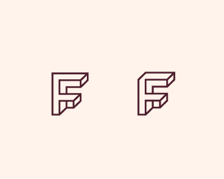
I`ve spend quite a lot time on the previous concept and when there`s enough lines to make F easily visible, doesn`t look as interesting and vice versa. So, having time scope in mind, i toss it away.
Right one here is more `accurate`, but seems that left one flows better. Which one of these two you prefer?
Status:
Unused proposal
Viewed:
1439
Share:



Lets Discuss
Wizemark I agree that the right one flows better.
ReplyRight one for me. Theres no reason not to follow the perspective on that edge.
ReplyJust curious but what is the type of business for this logo?
ReplyThanks, guys!*Matt, they%60re specializes in manufacturing prototypes, production tools and moulded plastic and metal parts.
Replyhaha. I might be different from my friends, but left %3C3
ReplyWell, the little cube under the bottom-most horizontal bar on the 'F' bugs me, particularly when you did such a nice job of achieving flow on the other one. I know you're going for an 'escher-like' look here...why not do it with the one that has the least amount of 'stops'...%5Blines%5D...? Plus, the other one looks like a visual-brain-teaser/staircase. More escher-like to me. %3Curl%3Ehttp://logopond.com/gallery/detail/88372%3C/url%3E
ReplyThanks, Cris. :)*JF, i hear you. Idea with that cube was to show that 2nd bar is going behind the F..not sure did i achieve that here. Anyhow i don%60t like that bottom cube either so much, that%60s why i did that update. I%60ve spent way too much time on this concept and i%60m quite happy with it (one that you just linked). But i know that i won%60t be able to resist and most likely will play around more with the lines once i get to the color exploration. :) Thanks for the suggestion.
ReplyPlease login/signup to make a comment, registration is easy