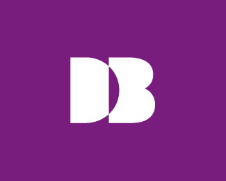
DB Monogram
by ricklandondesign • Uploaded: Oct. 12 '09

Float
(Floaters:
3 )
Description:
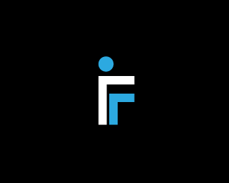
Unused concept for a monogram. I plan on coming back and reworking this at some point in the future.
Status:
Unused proposal
Viewed:
27789
Tags:
rick landon design
•
rick landon
•
landon
•
rick
Share:

Lets Discuss
Pretty sure I've seen this before. Can anyone link it?
ReplyClashmore did a similar combo a while back but none of his material is online anymore
ReplyI found this on Josiah's site. http://www.siahdesign.com/images/db-clashmore.png
ReplyDo you guys think they are really that similar looking? Other than the spurs and the fact I also used a %22D%22 and %22B%22 for the client's initials I don't see it. I just hope it's different enough to not cause a problem. BTW, the client didn't pick this one.
ReplyThese kinds of comments are more to push you as a designer to come up with a better idea. No, they're not very similar looking, but the general idea and execution is fairly similar. Also, your version looks more forced and unfinished, while Clashmore's feels complete. Hope this helps.
ReplyThanks Kevin, I really appreciate what you've said. It helps a lot.
ReplyThe De Beers diamonds logo is pretty similar. **http://www.flickr.com/photos/14718553@N00/480500003/
ReplyThanks for pointing that out Marco. I think I just need to follow Kevin's advice so it will have a chance to stand out on it's own.
ReplyLooking forward to seeing the update. Cheers Rick!
ReplyHey there. This is my logo, i made it. "DB" stands for "Darius Beldean"
ReplyPlease login/signup to make a comment, registration is easy