Pioneer
by Logomotive • Uploaded: Oct. 09 '09 - Gallerized: Oct. '09
Description:
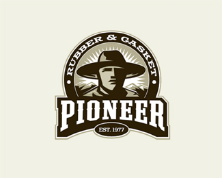
Logo Done for pioneer Rubber and Gasket. Copyright Mike Erickson and Logo Motive Designs and Respected owners. © 2000-2009.
Status:
Nothing set
Viewed:
27383
Share:
Lets Discuss
Nice use of negative space.
ReplyNice! Is that aviano slab I see?
Replywaooo, nice one as always
ReplyYou own this style.
ReplyMIKE stands for: M-ay I K-ill (your) E-go?
ReplyMasquables
ReplyI love this style Mike!
ReplyWhatever ya all said and all, like Masquables Thanks! This is an old logo. been a while since I have done this style. Got kinda lazy.... and liked the minimalistic designs.*@Floris it's a Letterhead font designed by Chuck http://www.letterheadfonts.com/fonts/fancyfullround.shtml
ReplyBy the way tell Chuck I sent ya for it. It works NICE on a curved path.
ReplyRoy, by the way. This is probably the only reason I am around today. This style is what set the stage for me.
ReplyMasquables is the highest form of honor one can receive.
ReplyWell I am honored and humbled :) thanks for the definition, guess my vocabulary needs improvement %3B)
ReplyAmazing
ReplyThanks Julian, hows Biz %3B)
ReplyWow. Great stuff.
Replythis will make gallery
ReplyVery balanced use of detail. Nice feel*
ReplyAny idea how many different color schemes they have in use? I notice they use a purple/orange and a blue/orange on their website.
Replythanks for the tip Mike!
ReplySaw this one in the gallery on Letterhead Fonts. Really nice, as always.
ReplyThanks Guys. Jared No I have not seen it in a while. I suggested monochrome, but hey.*Thanks Steve, yeah Been on there for some time now.
ReplyThis is incredible, Mike!
ReplyWooaw! Mike, nice work here brother... Timeless.
ReplyThanks Euan and Rudy.
ReplyIf you don't mind, I would really appreciate it if you could just let me have this.
ReplyWell since you asked so nicely...? %3B)
ReplySweet indeed!
ReplyThanks Michaelspitz
ReplyAmazing work Mike!! Love it!!
Replyfantastic
Replyperfect!
ReplyRoy's right. You are killer at the crests. And um, logo design in general I think. I will always want to punch your abilities. They are ridiculous.*Great work, Mike.
ReplyThis goes straight to my very selective fav list, haha :)
ReplyOronoz, just trying to keep up with you %3B)*Tomme, thanks bud.*LBOI, thanks again %3B)*Ahab, thanks but please don't punch me.*Lecart, thanks woohoo love to make favs.
ReplyLove this look. Very stylized%3B prefer these to minimalistic logos any day. One thing that is very cool about this one is...even when scaled down to smaller sizes (shrunk), you don't lose the details %5Bunlike others one might see%5D. Fabulous.
ReplyI agree, Yeh ur right JF, this oldschool logos done with attention on detail are truly upstanding in our times. But I see perspective in minimalictis logos, too.
ReplyI'm digging this Mike, keep em coming
Replyi like your style
ReplyThanks Guys, Have not done too many Illustrated ones lately and kinda missing it.
ReplyNice!
Replyveeery nice work!
ReplyThanks basi and Ivan.
Replyooooww :) Good great type
ReplyThe best of your showcase. :%7C
ReplyThanks again ahmetbarin .Thanks Pierro matter of opinion I guess.
ReplyThis is stunning
ReplyThank you Nash.
ReplyWOAH!
ReplyAll of your emblem/badge work is great. Super inspiring.
ReplyThanks Action and Toddfooshee.
ReplyA Good friend of mine saw This logo at Walmart holding a bunch of pupmkins. Think it's a Rip? http://twitpic.com/77toh4
ReplyHoly mother of god, that looks like a rip to me! Geez. if your mark is in use you should let the client know.
ReplyI know Sean, you never would think a Really Illustrative Logo would be but Yes they do. Unbelievable.
ReplySo sad.
Replyi like this
ReplyI forgot the Pumpkin factor!!
ReplyPlease login/signup to make a comment, registration is easy