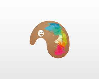
Palette + Person
by HelveticBrands • Uploaded: Oct. 06 '09
Description:
Work in progress.
As seen on:
http://www.dache.ch
Status:
Nothing set
Viewed:
1448
Share:



Lets Discuss
looks more like an elephant...still very cool
ReplyHah I was just about to address the left section of the palette for that
ReplyI like the paint treatment. Very unique.
ReplyPerhaps adding eyes has fixed the negative space.**Thanks Kevin. I think more highlights here and there is still needed.
ReplyPlease login/signup to make a comment, registration is easy