porechandballcup
by mirda • Uploaded: Aug. 28 '09

Float
(Floaters:
7 )
Description:
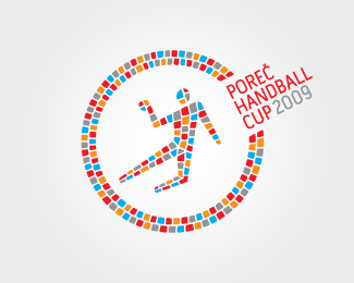
Final version of the logo for Porec Handball Cup 2009
As seen on:
http://www.porechandballcup.com/
Status:
Client work
Viewed:
1491
Share:


Lets Discuss
This version seems to communicate with less, but does a better job of it, in my opinion. Circle around the player dominated before%3B now there's an increased sense of movement. And it's really effective.%0D*%0D*Also noticed you adjusted the shapes of the tiles to, I assume, create more movement as well. Plus, it looks like the colors of some areas were adjusted to make them stand out more. I liked the other one%3B I like this one even more. Great work!
ReplyI think this is awesome..
ReplyThank you guys!
Replyinteligent and inovativ design. bravo
ReplyPlease login/signup to make a comment, registration is easy