X-Blades
by Alto • Uploaded: May. 23 '09
Description:
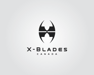
Logo concept for a Canadian hockey skate manufacturer. Abstract "X" makes up the logomark. Sharp points represent the blades of the skates, and there is a hidden maple leaf in negative space.
Status:
Nothing set
Viewed:
3791
Share:




Lets Discuss
cool**
ReplyWhat font did you use?**
ReplyThe font used is ORBIT Bold, from Thirstype. You can pick it up from %22Village%22:http://www.vllg.com/Thirstype/Orbit/mudTyper Weights/
Replyvery effective..
Replycool mark... nice work...
ReplyPlease login/signup to make a comment, registration is easy