Sensor
by TECHNEO • Uploaded: Jun. 23 '08 - Gallerized: Jun. '08

Description:
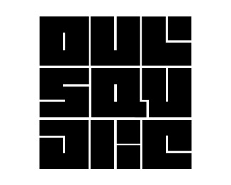
logo for techno-clubnight
As seen on:
www.techneo.info
Status:
Nothing set
Viewed:
7438
Share:



Lets Discuss
Nice. Have you tried the red dot in just one of the letters, such as the O, leaving the rest grey?
Replythank you!*Yes i've tried. But it didn't work the way i wanted...*Now every dot is the base and center of every letter/shape and that gives just that touch of stability i guess...
Replythank you!*Yes i've tried. But it didn't work the way i wanted... Now every dot is the base and center of every letter/shape and that gives just that touch of stability i guess... Or did i understand you wrong? Do you mean: maintain all dots, but just 1 in red?
Replythank you!*Yes i've tried. But it didn't work the way i wanted... Now every dot is the base and center of every letter/shape and that gives just that touch of stability i guess... Or did i understand you wrong? Do you mean: maintain all dots, but just 1 in red? Hmm, that's possible maybe... i'll have a look!*
ReplyYes, just one in red, the rest neutral.
ReplyI think having all the dots in red helps to emphasise lights/strobes/chemicals/dialated pupils/chuppa chops... and what ever else goes with rave culture :). **Nice job TECHNEO! I'm sure this would look fantastic as a backlit sign above a dark unsuspecting club door.
ReplyNice logotype. And still legible.
ReplyVery legible, which is rare with those things :) Stellar work, mate!!! Are you on Behance.net as well?
ReplyEeh, not yet... checked it out a few times, but didn't have the time yet to really do something with it.*I hope soon! :-)*
ReplyYou are really a TECH freak! Nice job!!
ReplyPlease login/signup to make a comment, registration is easy