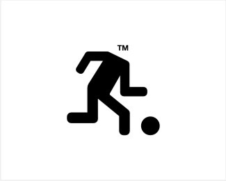
Use your TM :)
by Muamer • Uploaded: Jun. 16 '08

Description:
© Muamer ADILOVIC DESIGN // MA:DE
Status:
Just for fun
Viewed:
5874
Share:


Lets Discuss
i think you need to sort out the legs cos the proportions are wrong...from the knees downward needs to be a bit longer or make the thighs shorter...
ReplyYes, I know, you are right about proportions... But, that is purposely. This is concept and reaction on dude from %22exit%22 sign, nothing else..... As you can see, many other things are not correct here :)))
Replyi like this just the way it is!... if you ever look at a real 'exit' sign the man making a run for it has never been proportionally accurate... maybe that has something to do with his hasty exit... %22dont pay up %26 ill break your other leg.. now f*ck off!%22... or the common %22called me a peg leg freak huh?... watch how your building burns with you in it.. haha..haha.. haahhaaaaa....%22 %0D*%0D*it does remind me of a nike advert not long ago however.
Replyjust great...great concept
Replythis funny, great job
ReplyNow top making 'madeup' logos Muamer! Where is the brief here? I am glad this is not in the gallery! Yet :)
Replytop.stop.make it non.stop :)
Replyman-design.net %26 ndmgfx %3E Thank you! :)%0D*%0D*Logoholik %3E Thanks :) The brief is %3E USE YOUR TM! %0D*%0D*8-)
ReplyThis is very creative and funny :-)
Replyhaha brilliant!
ReplyClassic.
Reply%3C Thanks: eps, biro %26 mike :)
ReplyFantastic!!!
ReplySTOP IT. Your comments have been recorded.
ReplyThank you, Gilevad !
ReplyPlease login/signup to make a comment, registration is easy