doodle creative
by rcheney • Uploaded: May. 23 '08
Description:
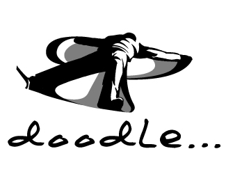
This is a logo proposal for our in-house creative department, which was in the process of being re-named.
Status:
Nothing set
Viewed:
1247
Share:


Lets Discuss
It's a fun concept! The hard edges of the box around %22doodle%22 don't seem to go well with the fluid nature of the mark to me.. I would consider either softening it in some way or getting rid of it altogther. Good work.
ReplyI think maybe you're right. Thanks for the advice!
ReplyI love this. Pulls you right in.
ReplyPlease login/signup to make a comment, registration is easy