Admajik v2
by firebrand • Uploaded: Apr. 07 '08 - Gallerized: Aug. '10
Description:
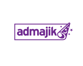
Online advertising marketplace.
Client wanted a cartoon feel rather than a corporate look. Haven't nailed the colours yet.
Status:
Nothing set
Viewed:
7917
Share:
Lets Discuss
This is clever, Roy. Not sure about the gray with the purple though. What else have you tried?
Replywhat about a royal blue for the background of the rectangle and a lighter blue for the hat so that it shows more of a curl?
Reply@itsgareth: Royal blue is a good colour for the wizard hat but I'd prefer to keep the background white as it represents an ad or billboard. I'm going to try your colour scheme though. Cheers.
ReplyI really like it. The only thing I would suggest is to shift your type to the right closer to the curl so that the %22k%22 falls behind it just a little to help emphasize the fact that the box is curling up. It would just help to serve as another visual cue.
ReplyGreat i like this and the rabbit both. Is there a way you can use them as a series? That might be fun too. Like a top hat upside down, a magic wand, etc. I think that would be a lot of fun! Anyway just dreaming. %3B) Great work!
ReplyThanks for the input everyone. I'll put my thinking cap on.
ReplyLove it. Enough said!
ReplyThanks, bart.
Replyhhmmm.. have you tried putting a rabbit over the 'ji' in majik?
ReplyNow there's a thought. I'll see what I can do :P
Replythe way you roll magic hat is brilliant.
ReplyWow! how'd I ever miss this one Roy? it's brilliant.
ReplyOh yeah, I was supposed to tweak this a year ago. Cheers guys.
ReplyI don't think it needs tweaking - very nicely done.
ReplyRevisiting this old chestnut. Tweaked the curl. Colours next.
Replysuch a perfect solution.
ReplyI like it a lot, clever work
ReplyI say deep yellowish and Purple Roy.
ReplyGREAT!
ReplyI hadn't seen this before. I really like it!
Replyvery clever and so nice and clean. real nice direction.
ReplyThis is really nice, awesome job Roy
ReplyThanks for the comments fellas. It's kind of similar your style don't you think Sean?
ReplyYeah. This is great Roy. It's been a while since I've seen a logo that has this style.**The animation for this logo could be magical, too!**Great work!
ReplyOne of my favs in logopond!!
ReplyThanks guys. I'm having a pig of a time trying to make a hires pdf at 2.30am, so this is cheering me up.
ReplyThis is great. Really like it :)
Replywhere was this piece of magic hiding?
ReplyCool mark! Great concept :)
Replygreat job Roy.
ReplyThank you all. Maybe I'll leave the colour. If it aint broke...
Replylooks smashing Roy..the colour works for me!
ReplyLove this as it is! great vector work
ReplyCheers, Niall and Joel.
ReplyOh – So – Great!*Loved this book as a kid! %3B)*http://mysticmedusa.com/wp-content/uploads/2009/07/wizard_mickey_mouse-med.jpg
Replyguess you can't do em and en dashes here..
ReplyI really like this! Type fits together nicely and the curl / hat idea is brilliant!
ReplyThanks for the comments and floats. :)
ReplyWell done! Here is an idea and its perfect realisation!
ReplyCheers Petro.
ReplyGreat logo, really nice. Maybe fewer stars though? Right now it looks a bit cluttered. Otherwise, it works perfectly.
ReplyCheers Michael. Maybe you're right, they're all pointing the same way too. :)
Replybrilliance
ReplyPlease login/signup to make a comment, registration is easy