Deviant Art
by MichaelDesign • Uploaded: Jan. 18 '16 - Gallerized: Jan. '16
Description:
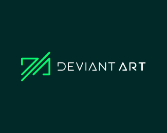
Proposed redesign logo deviantart
As seen on:
http://www.deviantart.com/
Status:
Just for fun
Viewed:
9234
Tags:
green
•
art
•
deviant
•
DA
Share:

Lets Discuss
Innovator! Very good!
ReplyThank j�ssica!
ReplyI really like the subtle interpretation of the D/A in the logo mark. There's also a really nice sense of movement to the design. Have you tried stacking DEVIANT and ART since it's a bit long of a name? I think that might create a better balance. Also, it feels a little odd that you've bolded ART but not DEVIANT. I'd maybe try bolding both words. The bolder text will also match the weight of the logo mark a little bit more. Lastly, the T in ART feels a little too thick in comparison to the rest of the letters. All in all, very nice design.
ReplyI agree with everything you said, Thank you!
ReplyNice attempt..
Reply@ocularink: Very very constructive feedback. All the best for your career at Emma
yes, it was a great feedback @ocularink
ReplyNice, why not?
Replypls tell the font you used here!
Reply@Orphydian I did the font
ReplyCan I buy it? Logo matches the initials of my startup and design suites nature of my company.
ReplyPlease login/signup to make a comment, registration is easy