Logopond Identity
by LPAdmin • Uploaded: Jun. 02 '15

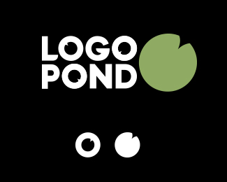

Float
(Floaters:
37 )
Description:
Lumavine, think you hit the nail on the head with this one, going almost totally away from the original, but still maintaining the 'pond' and logos, and having multiple 'pads' signifies the multiple designers here. If you will allow me to use this concept, I think the buck stops here.
Status:
Client work
Viewed:
5812
Tags:
logopond
Share:


Lets Discuss
I would love to see it used by this great site! I am honored to give back a little to a place that has given me so much. Thank you!
Replyemail me your address want to send you something
Replyhttp://logopond.com/thesandbox/
I know it's your choice, David, and I respect that. I also know this isn't a contest or up for vote, so going with your heart is your prerogative. But I will say that from the outside looking in, I have seen more engaging and professional avenues suggested. And nothing against Lumavine, because a few of them were his/hers, but something about this particular concept comes off as a bit childish and undeveloped. Personally if we're going to go for a more serious, mature setting, I think you should keep looking.
ReplyIt may be the 'chubbiness' of the pad, or the weight of the text, or the symbol looking like an eye rather than a lilypad, but I just feel like this still has growing up to do, and it makes me just a little sad to think that we would stop short of that awesome image.
Just my perspective of course, and I hope you don't take it as a slight. Ultimately you'll make a good call. :)
Actually, I think it's just this variation and this type. Looking at the original concept, I like it. It may be the text and it looks like the outer line here is thicker.
ReplyYeah I'll polish the mark as I see how its a bit chubby, but I do feel this is the direction I want to go with.
Replyagain over the course of all of this alot of people have told me I'm not going to please everyone, so get to a place where you are comfortable and listen to what resonates with you (thanks Kevin) and let that be the reason.
I understand that. And like I said, following your heart is ultimately what you'll do, and that's not a bad thing. I like the idea of thinning it down slightly, and Lumavine's original looks very nice in that department. Maybe it's simply the text, I dunno. But yeah, you won't please everyone. I'll await your final edition before I mutter and complain. :)
ReplyOh, one question I did have; is the blue something you're going to pursue also?
Replyprobably not, Ive been seeing in my head differing shades of green diamond (squares on their pole sides) as a possible back ground. I may introduce themeing in the new design so you can pick from custom theme backgrounds and colors controled from your admin area. I thought about doing that long time ago, might be time to dust it off specially with advancements in CSS3
ReplyHere's my $.000000002
ReplyMaybe it's just me, but when I think 'pond' I don't automatically think 'lilypad.' So to me, the strict adherence to the lilypad references seems to limit what can be done with the mark.
However, if you're trying to maintain brand equity, and you feel that ditching the lilypad reference will kill that, I can understand.
But - and no offense to Luma, whom I appreciate and admire dearly - I feel like this option is too much of that reference. I get that the multiple O/lilpads rotated in different orientations are supposed to suggest the vast membership here, and I'm kind of OK with those, but to then have a gigantic lilypad icon in addition is overkill IMO.
If you are dead-set on this approach, I'd find a way to ditch that huge lilypad icon, and let the smaller ones inside the O's do the work. Maybe make them a bit more indicative of lilypads, so people know what they are.
But, you have to think - there are people who are familiar with LP and where it came from, and for those, something like this logo will make sense. It's a logical progression. But there are those who are only now discovering LP. For those people, you want them to understand what the logo means, right?
It's my honest and humble opinion that for now, a simplified lilypad icon paired with nicely set type would do wonders for the site. Most of these reworked logo proposals have been way overthinking the issue.
With this new LP logo, we need to BOTH maintain brand equity AND hook new members (and they need to quickly 'get' what the LP logo is, no guesswork.)
I added a variation that thins the font a bit, emphasis the pad more and looks less kidish.
ReplyI understand what you are saying Jon and I agree but I think this logo accomplishes that. I am kinda seeing that the large pad is overkill when paird with the logo, but i do think it works in terms of the branding like how its seen on twitter in particular.
again look at this logopond.com/thesanbox, I think this is an awesome next phase/step that should not through old people who are used to the lilly and new people I think weill get the reference of 'many pads' Also the new site will have an organizational area that I think will REALLY get used of a pintrest style favs area, which I believe after extensive use and the lingo getting adopted of using 'pads' to organize your fav logos into certain groups, I think this logo will really shine.
I am grateful for seeing this rendition that lumavine put out because it really reflects a new direction that I think the site is /has naturally taken. I think when logopond first came out it was this new shining flower on the web, but this site has slowly turned into a real research and dev site, the search page is THE most used area of the site hands down.
which means to me that people are using the site to actively not just view random nice looking logos, but actually doing real life research for specific categories and looks etc.
Give this one a couple days to sit on you, and think about how you use and interact witht eh site and I think this will make more sense
I would echo much of what Jon said. I think it's a little overkill to have one large (and pretty plain) lily pad, and then several smaller lily pads sort of hidden in the type. And I have to admit, I miss the lowercase type. I think it gave a better and more unique shape to the overall logo. ALL CAPS seems to be too simple and less distinctive. Plus, lowercase has a better round letter/angular letter rhythm.
ReplyAlso, stacking "Logo Pond" on two lines feels unnecessary and pretty dense.
Very nice, thanks!
ReplyIn my opinion the idea of the social icon for logopond being an eye and a lily pad looks very badass and relatable for a graphic design webpage.
ReplyThe only thing that I think can be improved is in the word mark using the logo 3 times and then rotating every iteration is a bit too much for me. I think it's a better option to only have one lily pad O and the rest be normal ones.
If this version goes live I can't wait to see the favicon updated. The current one is hideous. xD
@joncgi this is old, are you saying the currently logo is hideous? i'd like to think you are joking.
Reply@ClimaxDesigns lol I thought this was a current wip for a redesign for logopond. No I didn't mean the current logo is hideous, just in my opinion the current favicon being a yellow blob doesn't look as good as it could be.
ReplySorry for the misunderstanding.
oh its not a blob its the middle of the pedal of the current logos lotus, i think the transparency is whats making it look blobish. i may just have to go with a white background on it
ReplyHello!
ReplyHow can I write you?
I really don't know what I did ... it seems my work is too bad ... what can I do but disappear ...
Replywow very nice
ReplyHello,
ReplyLogopond Admin & Team
I found a site that lists the logopond site, but they provide a Free Download Logo service.
It's as if our logo was obtained for free.
I also found another designer's logo on the site.
Link:
https://logolibre.com/logo/omega-infinity-keyhole-logo-3491322
https://logolibre.com/logo/letter-n-multiline-logo-3491308
I couldn't find any forums on Logopond, so I put this discussion on your logo.
Thank you
Regards,
Proffartline
Thank you will look into the matter, we gotta police for ourselves !!!
ReplyI've sent out a cease and desist but the email is bouncing, can any or you technical people maybe find out where its being hosted and I can try to reach out to the host for some help?
ReplyPlease login/signup to make a comment, registration is easy