Cream 2
by tdf • Uploaded: Oct. 19 '07 - Gallerized: Nov. '07

Float
(Floaters:
48 )
Description:
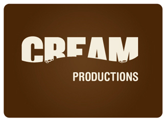
Final client approved logo for Cream, a television production company.
Status:
Unused proposal
Viewed:
10679
Share:


Lets Discuss
love the movement on this one. Great job!
Replyoooo, it looks so creamy. I could reach out and slurpt it.
Replylove it! although I feel the 'productions' is kinda lost all out there on its own, I think the fonts maybe a bit tall...just my opinion,
Replygreat use of negative space. i like it.
Replythe logo have reflect the real sence of the production aim..%0D*the color and the type face and background..all are perfect..%0D*
ReplyReplay? This featured in Oct and Nov... lol!!!
ReplyGreat work. Congratulations... slurpt it, so nice!
Replyhmm yummie! which font is that cutie? regards!
ReplyThanks!*It's Omnes by Joshua Darden.
Replyi like this font %5E%5E
ReplyVery nice logo! I think the roundness of the font complements the wording. I love the bubbles :-)
ReplyFavorite!
ReplyI love the bubbles, nice touch!
ReplyPlease login/signup to make a comment, registration is easy