Description:
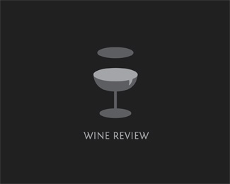
A few versions of my Wine Review with variations on the chat bubble. Thoughts? Cheers!
Status:
Just for fun Viewed:
2970
Tags:
beverage
•
Wineglass
•
Chat
•
Review Share:
I think the quote bubble should just be the lower oval (but a bit more apparent). Lose the top one and just have a subtle glass shape tinting the background. Could be cool! But this is just IMO.
Confused. You ask us what we think but do not seek critiques.
Nevertheless, I think its a fantastic concept! But after looking at it longer, I can't help seeing a chipped glass.
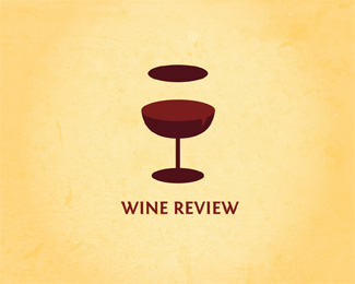
Hey thanks atomicvibe and chanpion! I changed it to just one lower chat oval; I think it helps with the chipped glass look. And yes, I welcome your constructive critiques. :)
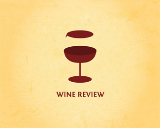
Hmm...while it gets rid of the chipped glass feel, it doesn't really emphasize the speech bubble part does it? Try applying the bubble tail to the side of the glass. So the top bubble will have the tail on the left side and maybe the bottom bubble on the right side of the glass. Don't know if that makes sense.


Lets Discuss
I think the quote bubble should just be the lower oval (but a bit more apparent). Lose the top one and just have a subtle glass shape tinting the background. Could be cool! But this is just IMO.
ReplyThanks logoboom! That's a good idea...I'll upload another version...
ReplyReally clever approach!
ReplyConfused. You ask us what we think but do not seek critiques.
ReplyNevertheless, I think its a fantastic concept! But after looking at it longer, I can't help seeing a chipped glass.
Hey thanks atomicvibe and chanpion! I changed it to just one lower chat oval; I think it helps with the chipped glass look. And yes, I welcome your constructive critiques. :)
ReplyHmm...while it gets rid of the chipped glass feel, it doesn't really emphasize the speech bubble part does it? Try applying the bubble tail to the side of the glass. So the top bubble will have the tail on the left side and maybe the bottom bubble on the right side of the glass. Don't know if that makes sense.
ReplyPlease login/signup to make a comment, registration is easy