My Bartender
by LumaVine • Uploaded: Aug. 06 '12

Float
(Floaters:
9 )
Description:
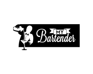
Version 2 of a logo for a new app designed for bartenders to let new and old patrons know when and where they're working while allowing patrons to find their favorite bartenders. The client requested a classic 1950's style harkening back to the days of Bogart in a white jacket. But yet it should be general enough to not exclude any gender or race, since the bartenders are a wide demographic. It should speak to the profession as a classy and craft oriented lifestyle, and show a resurgence of the pride in being a great bartender. The patrons are generally hip, young, and part of a night life scene. They love to use mobile apps to track the things they care about, and to connect with others. The client also mentioned the colors ivory and dark emerald green.
This concept combines M, Y, a martini glass, and a tuxedo.
As seen on:
Behance
Status:
Unused proposal
Viewed:
7566
Tags:
rank
•
mobile
•
green
•
typo
Share:
Lets Discuss
very nice ... very nice !!!!!!
ReplyThis one is my fav. Intuitive and clever.
ReplyMy 2nd choice would be version 4 (on green background). That one is more fun-having and friendly and this one more classy in my opinion.
Good luck!
Thanks so much guys! Unfortunately they went with a different designer - That is not my design on the site.
Replyhttp://www.choosemybartender.com/
I wish them the best with the app!
I like the Deco-inspired feel to this one, but IMO, the other M/Y tux/glass solution works better because of its simplicity.
ReplyPlease login/signup to make a comment, registration is easy