Ivya #3
by ivafrydkova • Uploaded: Oct. 21 '11 - Gallerized: Oct. '11
Description:
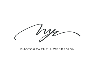
Another attempt for personal logo. Not sure about the "I"...
Status:
Work in progress
Viewed:
18592
Share:


Lets Discuss
Absolutely beautiful. The script is a tad hard to read but I wouldn't touch it. I'd simply add IVYA in the small type below.
Reply100%25 cyrillic 'Luch':)
ReplyI read this lettering as 'Luch' (Ray) in Russian.
Replyru_ferret, yes. This is a clock factory.
ReplyIt flows perfectly, love it!
Replythis is really nice.. but I read nyc from the thumb
ReplyWould work perfectly for belarusian watch brand.
Replyvery nice work! love the flow.
Replynice flow!
Replythat's hot. also read it as 'nyc' though.
ReplySo elegant
ReplyBeautiful curves. I mean the type.
ReplyAwesome work.
ReplyPlease login/signup to make a comment, registration is easy