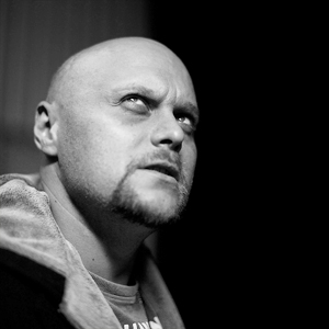
Strengthening at risk and homeless young mothers a
by SimonFenix • Uploaded: Jun. 20 '11 - Gallerized: Jun. '11

Float
(Floaters:
50 )
Description:
charitable organization
Status:
Unused proposal
Viewed:
13939
Share:


Lets Discuss
Interesting
ReplyI quite like this.
Replyyes ... very interesting
Replycool!
ReplyIt's so hard for me to read it!
ReplyIts really cool.
Replyanyone else see an erection? I felt the need to point it out not to be funny or rude, just something that immediately stood out to me.
Replyart is what you see in it ... but ... I really don't see that ... its a great deal with simplicity and clever creativity ... I like that !!!!
Reply%5EThis is true. I don't see anything phallic, but I do unfortunately read the background people as creepy and threatening rather than strengthening.
Replyi see here erection also :D
ReplyWhere???)))
ReplyI agree with Nathantrafford the black figures are looming over the hunched white figure that represents the child. Perhaps its the number of adults in relationship to the single child that is unsettling or the child's pose.*But IMO the child's pose gives the impression that he or she is afraid. The child's shape could have a phallic nature as it is protruding upward from the ground. Therefore, I might explore other child shapes that include arms. This will eliminate both the phallic nature of the logo that some see and perhaps portray a more caring tone. Hope this helps.*
Replyi don't know whether the child is hunched over looking down, or arched back looking up. I don't know whether that matters too much. The row of people are just very ominous. I think this is because they are fully black and are all exactly the same. This makes it very cold and emotionless. (think pink floyd's The Wall)
ReplyMaybe incorporate more support and hope like this example.*http://logopond.com/gallery/detail/136604
Replythe figures could be purple and yellow and it still wouldn't change the ominous feel here. I hope you're not suggesting racism.
Replylooking at it now, the color DOES add to the feeling of ominous, and there is nothing racial behind that at all. How are bad guys often portrayed in cartoons? All black (not their skin, more like a shadow), where all you can see is there eyes. It's not a racial thing. Robbers often pull dark masks over their faces where all you can see is there eyes and mouth. Dark is shadows, unknown, and fear. Light is vision and understanding. You can find racial things in whatever you want, but I guarantee you there is nothing racial about what I'm saying. It's the same thing as green meaning go, or purple meaning royalty. It's when people apply these meanings to categories of people that it is a problem.
ReplyI should have been a little more tactful with my earlier comments. And I agree with your sentiments here. Race, sadly, is such a negative term. Funny how you can move a few letters around and it becomes 'care'. If only the world were that simple
ReplyDavid, I was using color here as an identifier to illustrate my point earlier. However, colors are connected to emotion. The color black is also associated to mourning and funerals and these figures give off an ominous tone because of several reasons. First, there is no connectivity between the small figure and the crowd of figures. Second, the balance, proportion and scale between the spacial relationships is off. Therefore, It isn't about black or white as much as it is about scale, proportion and balance. Visually the dark shapes far exceed the space given to the child and I think it gives off a sense of uneasiness and thus the unnerving tone. My comment was meant as a helpful critique further elaborating on previous comments about the creepy vibe and explain the comments about the phallic symbols since the designer had asked %22where%22.
ReplyEverybody sees what he wants to see
Replyvery interesting
ReplyPlease don't be upset with me, but I feel like you may eventually have some kind of controversial issue in the future. It reminds me of this first logo listed here http://www.boredpanda.com/worst-logo-fails-ever/
ReplySimon, you are exactly right that everyone sees what they want. Which can be good and equally as bad if not worse. Which is why I sent the sample above in my previous comment. This logo leaves it's self open to a lot of negativity. Hence all the comments and controversial from your fellow designers...
ReplyI'm really sorry,but somebody show me where is erection or something else? Take this picture and draw it please for me. I'm relly don't see anything here. **PLease
ReplyPlease login/signup to make a comment, registration is easy