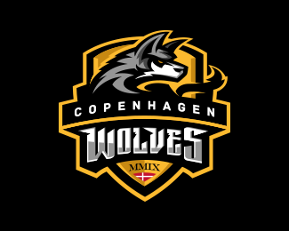
Copenhagen Wolves Gaming
by mattkauz • Uploaded: Feb. 21 '11 - Gallerized: Feb. '11

Float
(Floaters:
80 )
Description:
self-explanatory.
As seen on:
Status:
Client work
Viewed:
51461
Share:


Lets Discuss
Marvelous! Great! Splendid! Did you maybe try it with the solid black background (this gradient is the only thing that is throwing it off a bit)?
ReplyHow is this? Better?
ReplyDon't you think so? Pure awesomeness! :) Def your style, welcome back! :)
ReplyBoy did I really miss seeing new work from you, good luck with school in the meantime brother. Nice stuff here.
ReplyThanks JP. I have like 30 more logos to add... haha.
ReplyGreat stuff, Matt, good to see you again!
ReplyThanks Sean.
Replyamazing works, man.
Replythanks lecart. love your galley.
ReplyNice! : )
ReplyGreat style! I liked all logos. You are bigger star than NHL, NFL and NBA!! Cheers
ReplyMan that wolf haves so much personality, great logo!
Replydaaaamnn great one!
ReplyGreeeat illustration Matthiason!
ReplyRecognizable style. I love it!
ReplyLOVE the tail! Great details.
ReplyRealy great! Yeah
ReplyThanks for the kind words everyone! I'm honored that this made the gallery.
ReplyAwesome! You have a great style for mascot designs, gotta go check out the rest of your work.
Replysh*t I wish I could do stuff like this! thar cionn matthisaon.
Replylove love love it! GREAT WORK! i love these sports stuff. if i had to make a suggestion i would add some gray to the tail, took me a while to notice it was part of the wolf. then again it might become busy. regardless, awesome mark.
ReplyI actually tried that... but the grey highlights to the tail messed up the depth perception on the whole logo... it may be less realistic this way (in terms of natural lighting), but I believe that keeping the highlights on the head allows it to stand out more.
ReplyStunning graphics is a bright, dynamic style!
Replylove your style :)
ReplyHey man, I hope you reply to this, I know you modified the text alot, but can you tell me the font that you used for the Wolves part? Or was it custom?
Reply^From the looks of it, I'm almost positive that the Wolves type is custom.
ReplyPlease login/signup to make a comment, registration is easy