Okapi
by QueenCityStudio • Uploaded: Jul. 07 '10 - Gallerized: Jul. '10

Description:
This logo was recently selected to be featured in the next LogoLounge book (VI) which is due to be released February 2011.
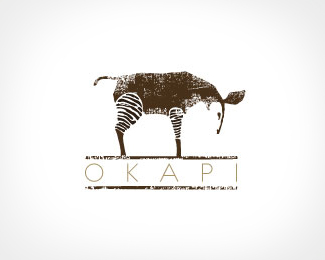
Concept: This was a strange project because the company made quilts but didn't want the logo to convey that at all. The owner loves Okapi's, and wanted the logo to feel "natural and established". So, after drawing many styles of Okapi's, we arrived at a grazing pose, using brown and tan, and added texture to give the logo a worn feel.
Status:
Client work
Viewed:
15624
Share:


Lets Discuss
so stylistic - mission accomplished - and congratz!
Reply%5Eagreed... great style...
ReplyNice one mate!!
Replyawesome! is the type readable if the logo gets smaller?
ReplyLove it! very nice :)
ReplyThis is what I call good stuff!
Replygreat looking piece. very cool.
ReplyTotally in love with textures at the moment, you have done a great job here.
ReplyFantastic work, has a great feel to it!
ReplyGreat style and texture. Definitely feels natural and established. In my opinion, there's some better fonts out there that offer a more natural and established feel, but hardly worth mentioning since it still works with this one.
ReplyGorgeous. Congrats on the selection for LogoLounge 6
ReplyThe type seems to look a bit thin for the mark...but, the mark is lovley!! :)
Replybeautiful technique!
Replygreat texture, love it
ReplyWow! Thank you everyone for the positive comments, means a lot.
ReplyOh, gorgeous logo! Love the texture, and the colour.
Replylove this one!
Replyamazing logo..
ReplyGreat mark, great illustration.
Replythis logo is functional as it is beautiful
Replynicely done!
ReplyFloated a while back but just stumbled on this beauty again... had to comment this time%3B amazing work!
ReplyPlease login/signup to make a comment, registration is easy