Fun in the Run logo
by levelb • Uploaded: Jun. 22 '10 - Gallerized: Jun. '10

Float
(Floaters:
77 )
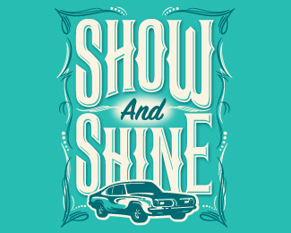
Description:
Logo for my neighborhood's first annual festival
Status:
Client work
Viewed:
32904
Share:


Lets Discuss
I like it
ReplyCool. I have on old polish tin like this.
Replygreat use of typography. really like this
ReplyThanks everyone! I tend to design on the retro side. This was one of those freebies projects that I kept putting off until the very last minute. Maybe i should procrastinate on my other logo projects! :-)
Reply%5E %5E LOL...this is beautiful.
Replygood work
ReplyGreat work here!!
ReplyI love the look to this.
ReplyGreat Work LevelB
ReplyGreat stuff!! :)
Replyahh so pleasure-ful to the eyes. nicely balanced!
Replygreat look and feel
Replywow such a great and simple solution...beautiful!
ReplyYour neighbor has a festival at their house?**Love the logo, though. I want a t-shirt with that on it. :)
ReplyGreat design. Did you consider having the lower line that wraps the edge connect to the %22n%22 in run instead of it being connected to the same line the the %22R%22 is tied to?
ReplyThanks again for all the compliments guys! **@anzo...that is a very good point! I hadn't thought about that but it give it a nice balance. I might have to give that a try. if anything it will be for my portfolio since the shirts are being printed now. If anyone is in Des Moines, IA on July 17th, stop by! :-)
ReplyI really like this, even the choice of color is superb, nice work.
Replysweet retro feel, nice work!
Replywow!!very cool
ReplyVery nice. Stands out great. Reminds me of old school hockey style logos they used to put on the pucks.
ReplySpot on man.
ReplyDesign like this makes me stare. And stare. And then... finally... hit... back.
ReplyThis is great my friend. kUDOS. I find it really interesting to achieve logos with that many typographies... Theyre all basic ones or custom?
ReplyThanks Pedro! They are all built off an existing typeface, but modified to fit.
ReplyI would very much like you commission you to make a logo for me using this style. I can't seem to message you thru this site however.
ReplyPlease login/signup to make a comment, registration is easy