Hootie&Sqweaks
by Mikeymike • Uploaded: Jun. 07 '10
Description:
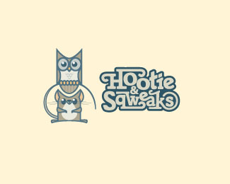
WIP> Trying some type. Is it working? curious.
original mark at http://logopond.com/gallery/detail/105931
Status:
Nothing set
Viewed:
2679
Share:





Lets Discuss
Still love that mark Mikey...great work.
ReplyIs it working?*YES, each working separately, but not working together.
ReplySo the styles are fighting too much, Mike? Just wondering.
ReplyI don't think the ampersand is working with the rest of the type, it looks like it was pasted over top.**I like the mark, the rest of the type %26 the colour palette, but all at once feels like a bit too much.
Replythanks, guys for the insight.
ReplyType's very intriging, but indeed, perhaps a bit much all at once.%3Cbr%3EGreat style though...and the illustration %3E still excellent! %3B)
ReplyLove these characters.**This may be stupid, but why is squeaks spelled with a %22u%22 in the title and a %22w%22 in the type lockup?
ReplyThanks, mike.*@danny. :) Wow, now you see why I am the designer at the agency and not the writer. Need to proof read more. :) nice catch, I'll change.
ReplyPlease login/signup to make a comment, registration is easy