ARTHAYASA STABLES
by damaraputra • Uploaded: Apr. 29 '10

Description:
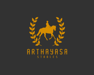
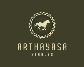
really needs for critiques. this is for my final exam. logo is about horse stable and riding school
Status:
Student work
Viewed:
4810
Share:


Lets Discuss
I like it! The only thing bothering me a bit is the size relationship between the horse and the laurel/leafs. The way the horse is almost touching the laurel, it's causing a tension. You might reduce the horse down or reduce the size of the laurel and get it away from the horse a bit. Just a thought.
ReplyDiggin the type a lot! Great movement with the bars... At the moment your 'H' is static though, and it's kind of throwing me off. Seems like that that guy should veer up to the left?
Reply%5E Yes, up toward the left, that is, to complete the up and down. Love the subtlety there.
Replythanks mate, i'll try that.
ReplyPlease login/signup to make a comment, registration is easy