Float
(Floaters:
0 )
Description:
latest work for my best client ever...
Status:
Client work
Viewed:
786
Share:

Lets Discuss
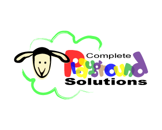
- too many (bad) colors*- semi-transparency takes away instead of adds*- squished fonts look very amateurish, try finding fonts that were made to have a low profile.*- what does the logo mark say about playground solutions? not much. Try using a mark that resembles a piece of equipment, seesaw, slide, etc*
Replysolventlabs:*thank you for your comment...you're right.*this logo was made for two merging companies who wanted to include one's mascot (green sheep) and the other's product (shade sail --%3E reason for semi-transparency and colourfulness).*
Replyits really not a good logo.. hard to read, too many colors, very messy, -- i would delete it and start over
ReplyOn first glance the logo made me feel happy. It's bright and fun but on closer inspection I have to agree with the others. The typography just aint quite right.
ReplyPlease login/signup to make a comment, registration is easy