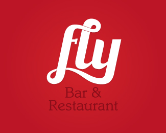
Float
(Floaters:
7 )
Description:
Logo for a trendy Bar & Restaurant in Downtown Tampa
Status:
Nothing set
Viewed:
1588
Share:





Lets Discuss
That's some pretty sexy type you've got going there... Wonder if the line breaks are necessary?
ReplyThanks Michael! I was worried it would read %22Ay%22 instead of %22Fly%22.
ReplyI agree with Michael. Really sexy type and great movement, but the line breaks are throwing this off. I think you'd only need to do minimal tweaks to this to balance everything out. Rather than 2 even width red strokes showing the overlap, how about tapered, triangular-shaped, shadow-like red areas beneath the overlapping lines? For example, where the top arm of the F overlaps the L, this shadow-like area would start thin on the left side of the L, and would widen to the right side of the L. Same goes for the swashed descender of the F, except that I would allow the swash to overlap (rather than recede behind) itself. Hope this makes sense. It's kind of hard to describe suggestions like these in text.
ReplyThat totally makes sense. Thanks for the feedback!**I'll give it a try one of these days :)
ReplyPlease login/signup to make a comment, registration is easy