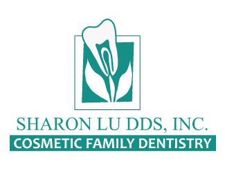
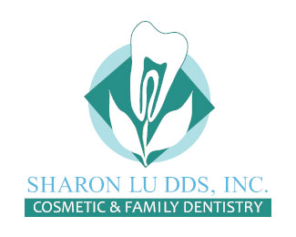
Hi Vivian. Thanks for your kind comments also. I totally agree with Kevin's comments on your previous effort with this logo. The best idea is to keep it simple... one suggestion would be to create the 'S' from the stem of the flower, then you wouldn't need to have the 'S' in the background as it is now. Keep it all very abstract with simple geometric shapes. Also the text is very long and I feel that the mark or symbol should be above the text. Keep experimenting and you'll get there :)
Good thinking I like the tooth is a flower idea. Does it seem a little odd to see the nerve ending in the flower? I like teeth, their shape is a lot of fun. Maybe just stick with that.**I agree with fogra, maybe use the %22S%22 to help the flower %26 %22S%22 combo.**Keep going %26 have fun with it. :)


Lets Discuss
Hi Vivian. Thanks for your kind comments also. I totally agree with Kevin's comments on your previous effort with this logo. The best idea is to keep it simple... one suggestion would be to create the 'S' from the stem of the flower, then you wouldn't need to have the 'S' in the background as it is now. Keep it all very abstract with simple geometric shapes. Also the text is very long and I feel that the mark or symbol should be above the text. Keep experimenting and you'll get there :)
ReplyGood thinking I like the tooth is a flower idea. Does it seem a little odd to see the nerve ending in the flower? I like teeth, their shape is a lot of fun. Maybe just stick with that.**I agree with fogra, maybe use the %22S%22 to help the flower %26 %22S%22 combo.**Keep going %26 have fun with it. :)
ReplyThanks you guys for all your comments. I will continue working on this. :)
ReplyPlease login/signup to make a comment, registration is easy